GOT A UI/UX
DESIGN PROJECT?

Designing a Fintech Platform for an Investment Firm
Domain: Fintech
Platform: Web & Mobile
Service: UX and UI Design
the challenge
“Mutual fund investments are subject to market risk.”
How many times have we heard this statement in the background, hardly paying attention to what it meant? Probably more times than we can count. Whenever mutual funds are mentioned, the conversation about it is usually vague and riddled with technicalities and jargon. The need for Goalwise was a seamless fintech platform, hassle-free UX and modern UI across devices where current investors could track their investment goals and new users yet to be acquired can explore the fintech platform, giving them the confidence to invest in Goalwise.
This was coupled with the challenge to increase the number of successful KYC registrations despite the long and tedious process, as it is the main prerequisite to invest in mutual funds.
the approach
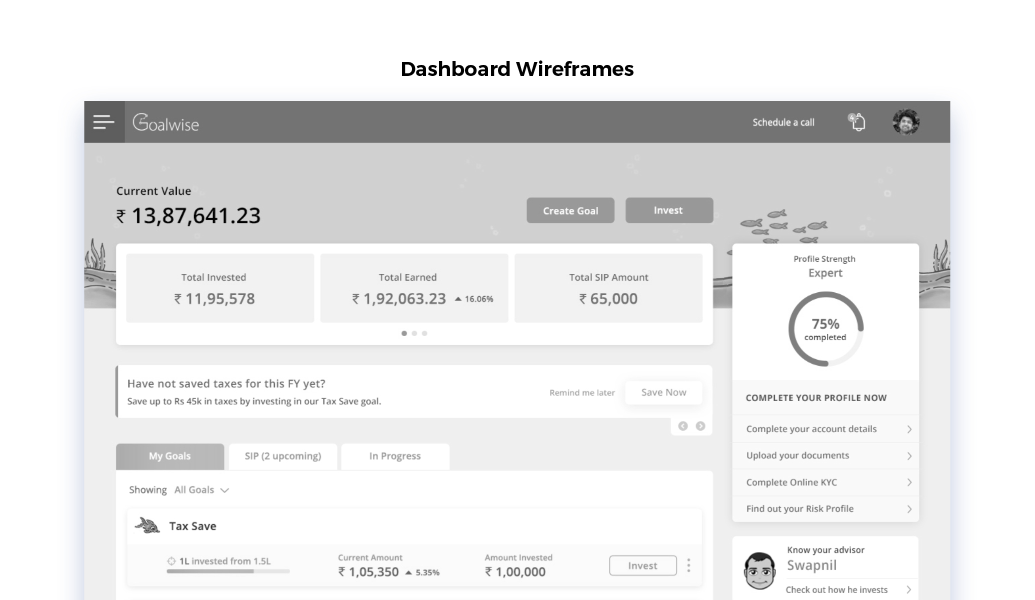
While brainstorming for the development of the application, we drew inspiration from the old adage “health is wealth”. Just like we take pride in having devices and apps that track and have visibility of our daily fitness activity, we decided to create a platform where the customers could track the health of their wealth end-to-end.
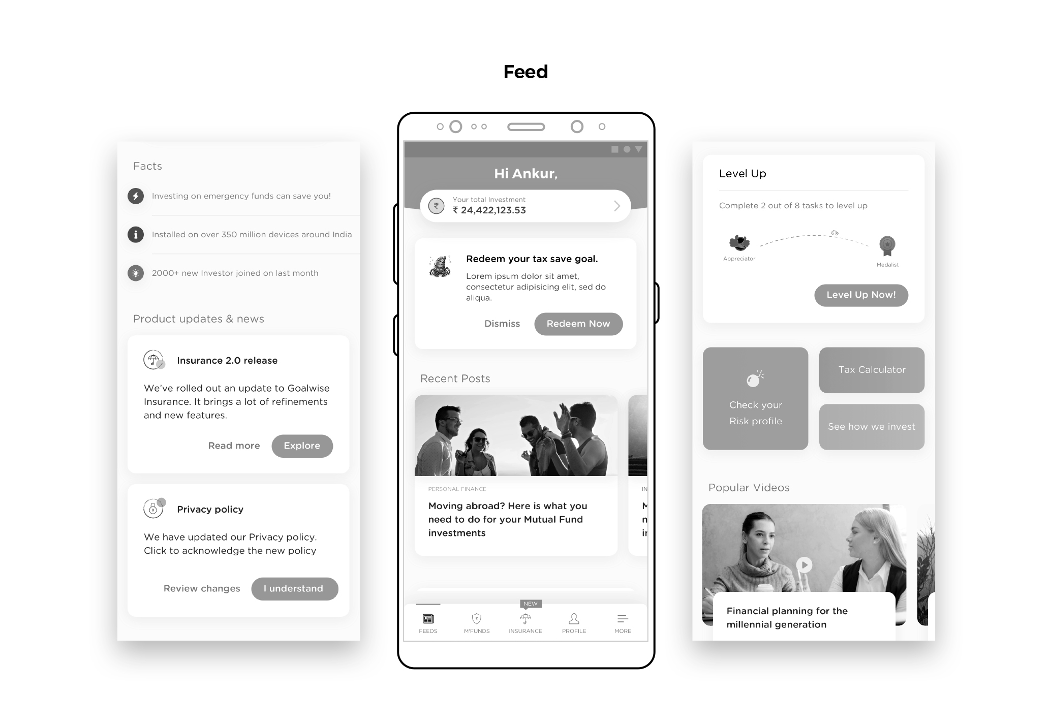
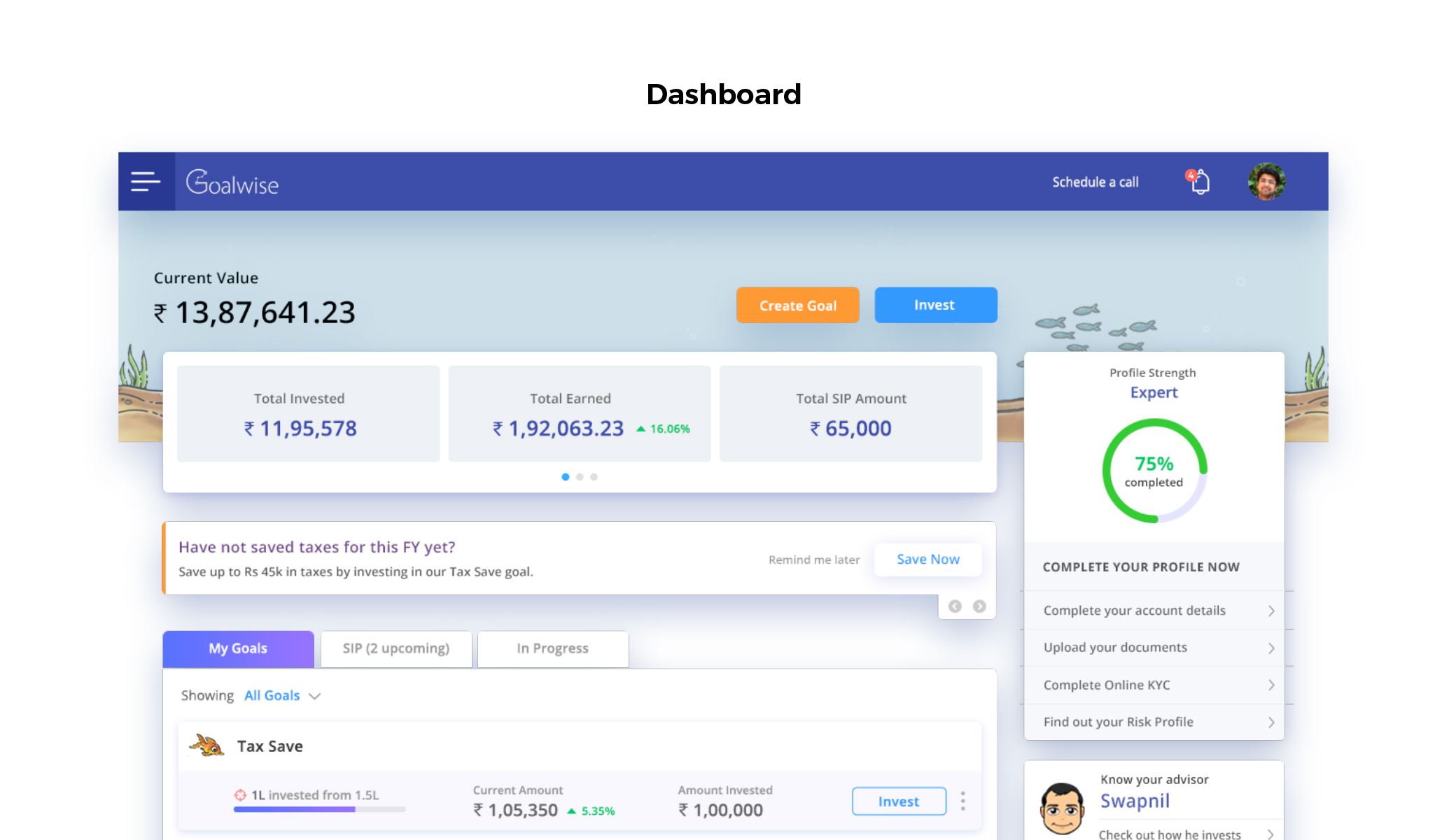
To encourage user engagements, we introduced a feature where they could see the progress they were making in their investment goal if they were on track. The constant visibility would add to a sense of accomplishment and awareness, making users come back to the app repeatedly, increasing user retention.
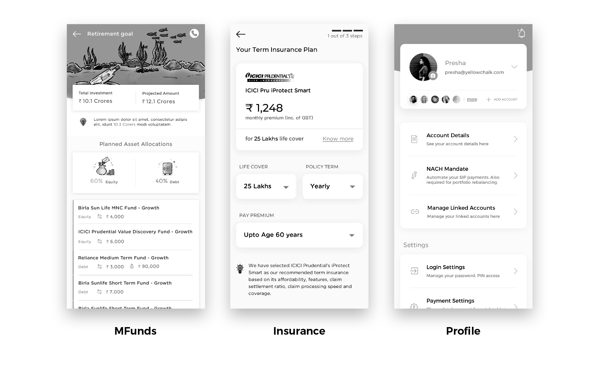
To have consistency across the app, we took it up a notch and introduced a feature where the customer could see how off-track they were from their goal in case of a missed payment or a sudden withdrawal.
UX Strategy
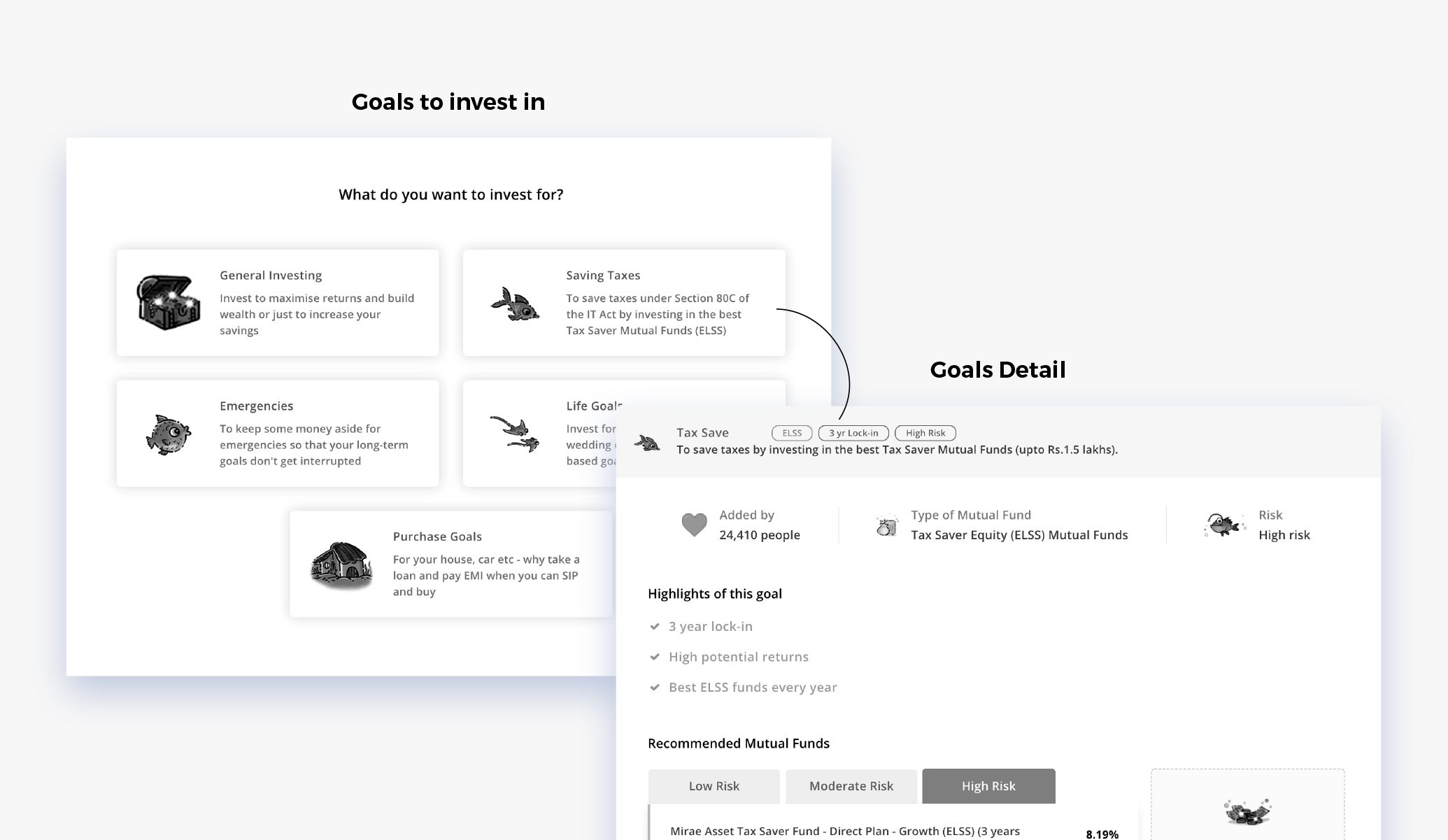
The world of investment is confusing and unnerving to a novice. We wanted the users to feel like they were in familiar terrain. To introduce them to the complex world of fintech and make their journey seamless, we designed a chatbot to identify and guide new users to their ideal investment goal through a series of questions.
To increase user retention, we decided to give the application a human touch. We introduced a buddy system where a chartered accountant would assist the users with suitable investment options, plans, and best practices. The user would also be able to view the investment goals set by their buddy to build transparency and trust. The clean, minimalist, and intuitive, design which we created did not just guide the user but gently prodded them to the next step.
UI Design
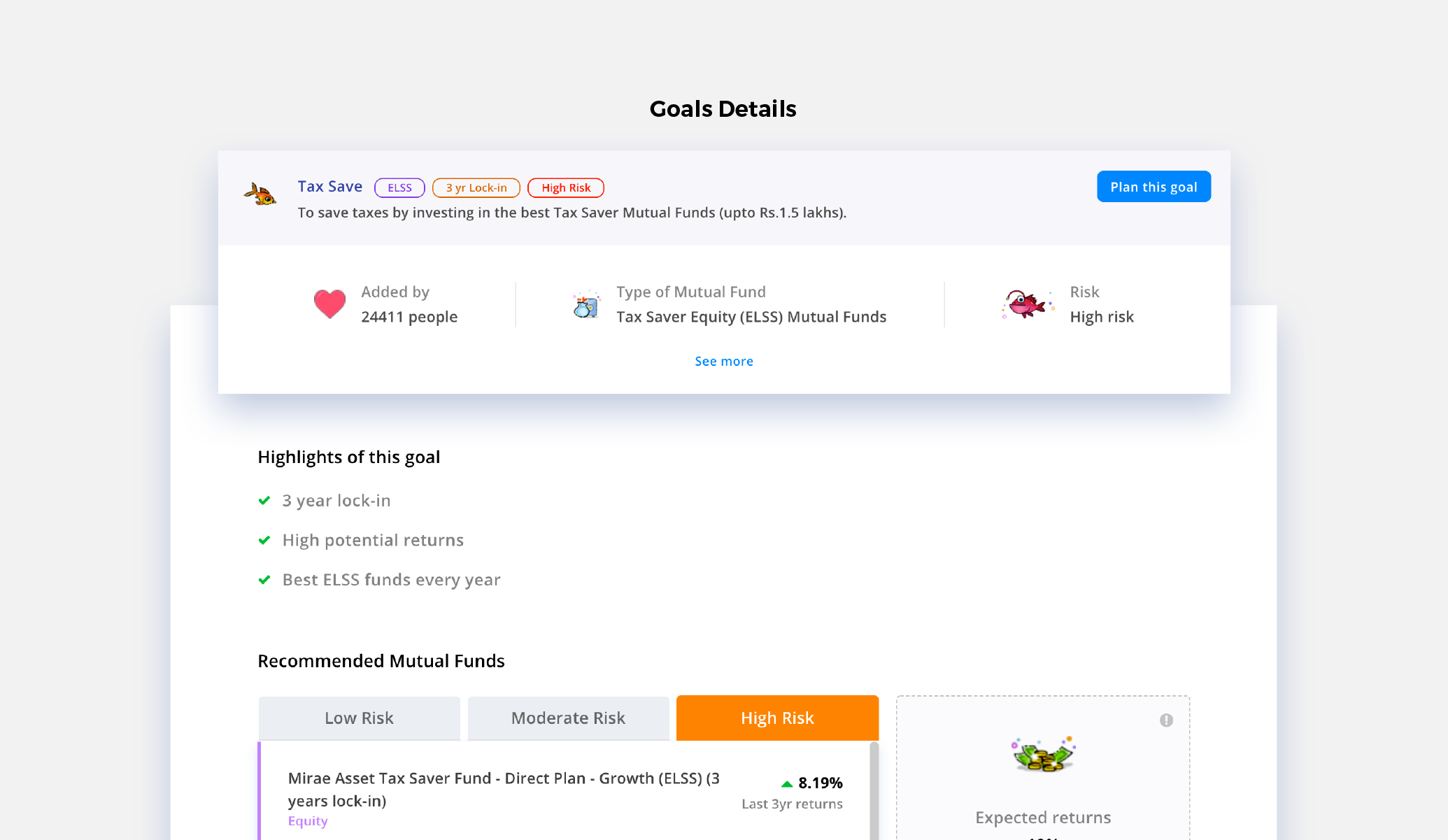
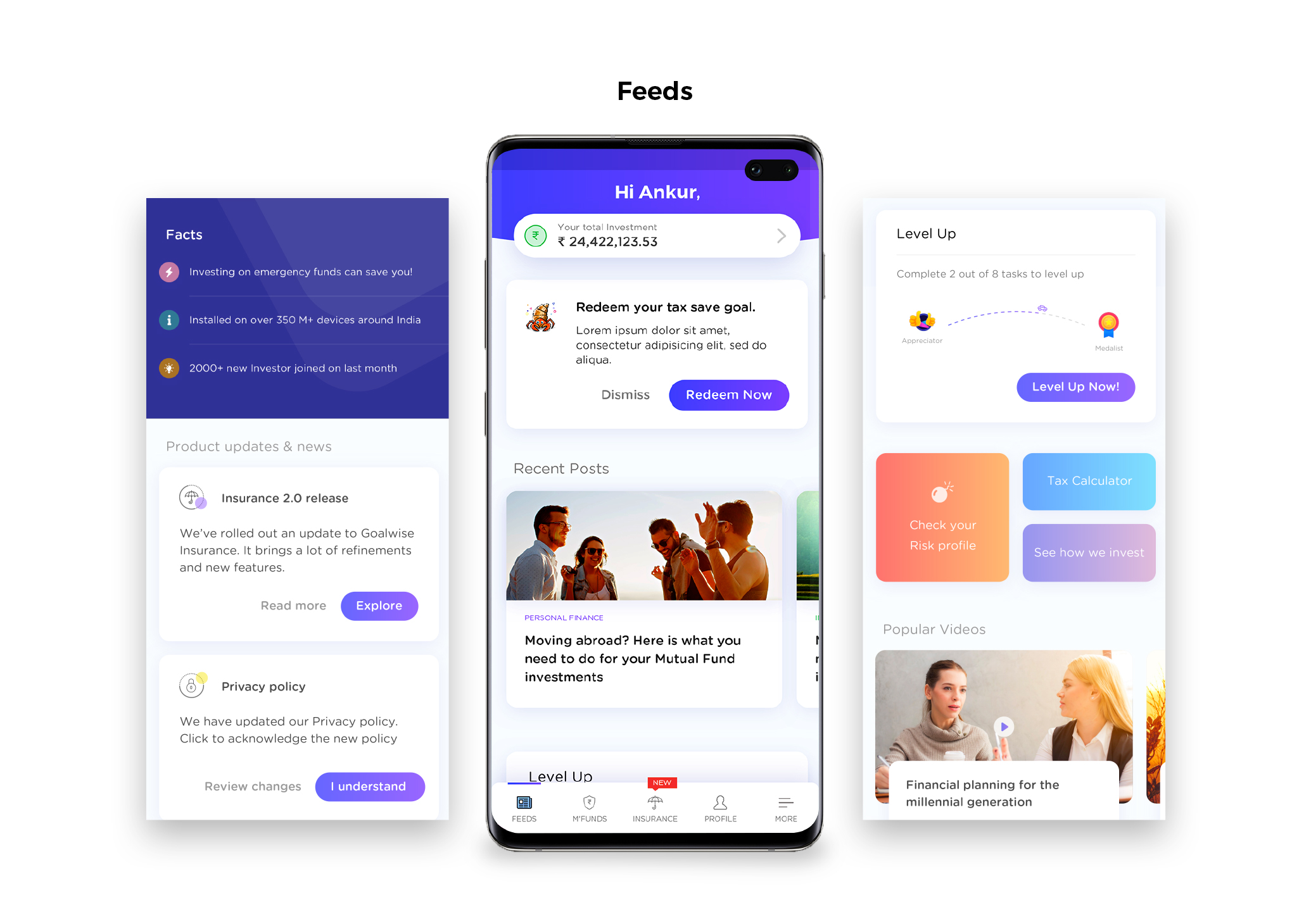
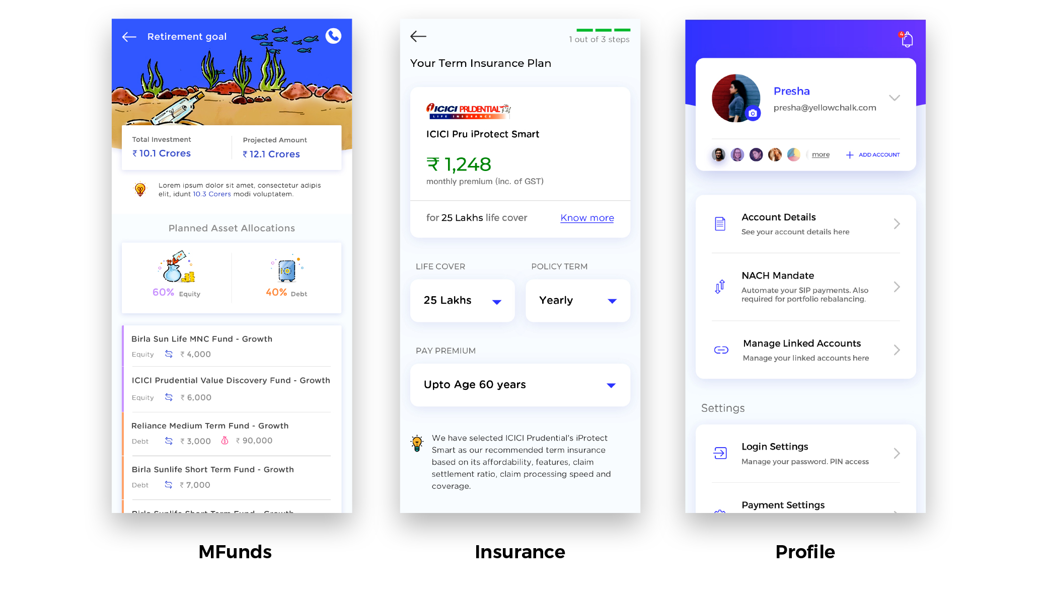
We used an underwater theme to represent a different world altogether. We wanted to give the users a sense of newness of investment along with a subtle but varied mixed color palette to keep the users’ attention on the task at hand. It also helped in making the investment process feel less daunting and gave the users a sense of comfort. The visuals and the content were designed to make the user feel comfortable with the technicalities of the process every step of the way. For the iconography, there is a strong presence of monetary signs and symbols to drive the point of the app home.
the result
We wanted to stay true to Goalwise’s vision of empowering people to invest like an expert without having to be one. Our cutting edge design coupled with Goalwise’s vision reshaped the way users look at online mutual fund investment products. By understanding and anticipating users’ needs, we created a seamless, intuitive fintech investment platform that gave people the exceptional service they expected – and the control they craved.
Getting results & delivering on the promise is what we do best
“The Yellowchalk team gets UI/UX and produces great looking yet functional designs. The design that they did for us at Goalwise was one of our USPs which helped us grow organically while creating a fan base of more than 10,000 users. Over the course of my 4-year association with them, I have approached them time and again with complex design requirements and they have always delivered.”
Ankur Choudhury
Co-Founder & CIO, Goalwise


