GOT A UI/UX
DESIGN PROJECT?

Designing an Insurance Integrated Health App for Mobile – Vidal Health
Domain: Healthcare & Insurance
Platform: Mobile
Service: UX and UI Design
the challenge
Vidal Health TPA (Previously known as TTK Healthcare) is a pioneer in India for providing health insurance and healthcare services in partnership with a wide network of specialty hospitals, nursing homes, and diagnostic centres.
They wanted to build an integrated and efficient health app where all healthcare services offered by them were available to their customers at the click of a button.
The challenge for us was to help them break the mould and go beyond providing customers with only health insurance. We wanted to understand the business apparatus to make them a one-stop solution for all health requirements.
the approach
Vidal Health was offering customers an application for each service they offered instead of using one integrated health app. Our research illuminated that this was one of the critical pain points, apart from other aspects, for the users as well as the technical team. It was making it hard for them to retain users as the users found it painful to install multiple applications and develop to avail the multitude of services they offered. The technical team on the other hand found it a burden to keep track of multiple applications.
After user interviews and internal and stakeholder sessions, we agreed to build a one-stop solution application to cater to their current and future customer base. We wanted to streamline their vision and consolidate all the services they offered into one application. It was also extremely important to make the customer the focal point of this vision.
UX Strategy
Since the app caters to customers directly, we wanted it to be devoid of any complications. We wanted every interaction that the user had with the application to be relevant. To make the user journey as seamless as possible, we decided to take a holistic approach to the design process. We wanted to build an application that not only solved the user’s immediate problems but also changed their outlook towards accessible healthcare. Our aim was to use the application to make a difference to the ecosystem of healthcare for the users. This started with us classifying each service that Vidal Health had to offer and making them visible to the customers upfront to avoid any confusion.
Simplicity was also a guiding principle as we wanted to make user satisfaction a key milestone for customers using the app. This entailed getting rid of any hurdles visually or in terms of content. We used simple, straightforward language to remove any friction and insecurity in the users along with unambiguous visualization to speed up the decision making process. This would ultimately result in an interrupted user journey for the customer.
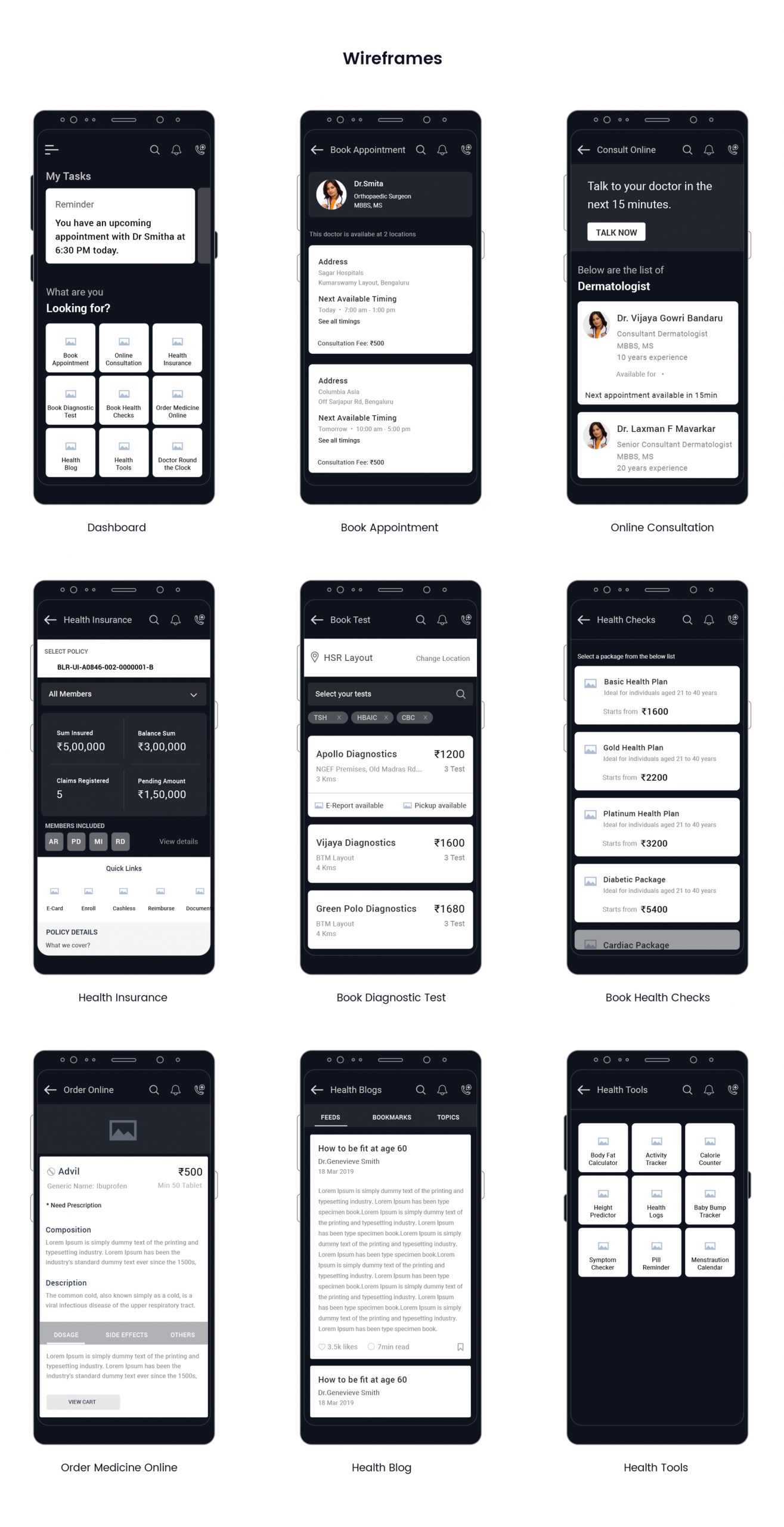
UI Design for the Integrated Health App
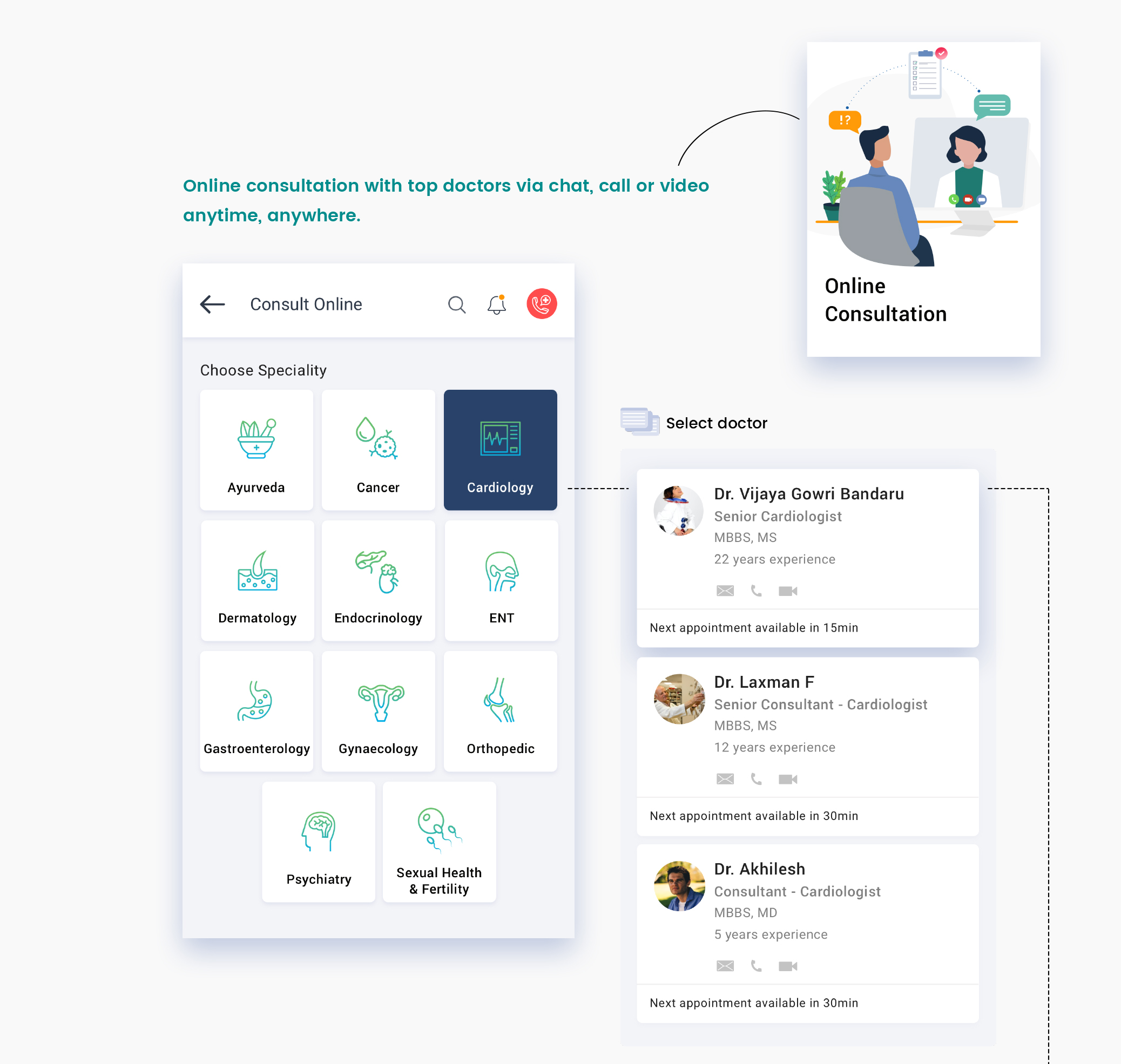
We wanted to leave no uncertainty for the users while using the app. We went with a clean user interface and avoided cluttering the screens with too much information. The iconography used was minimal, clear, and legible to support the content and reduce hesitation in the users.
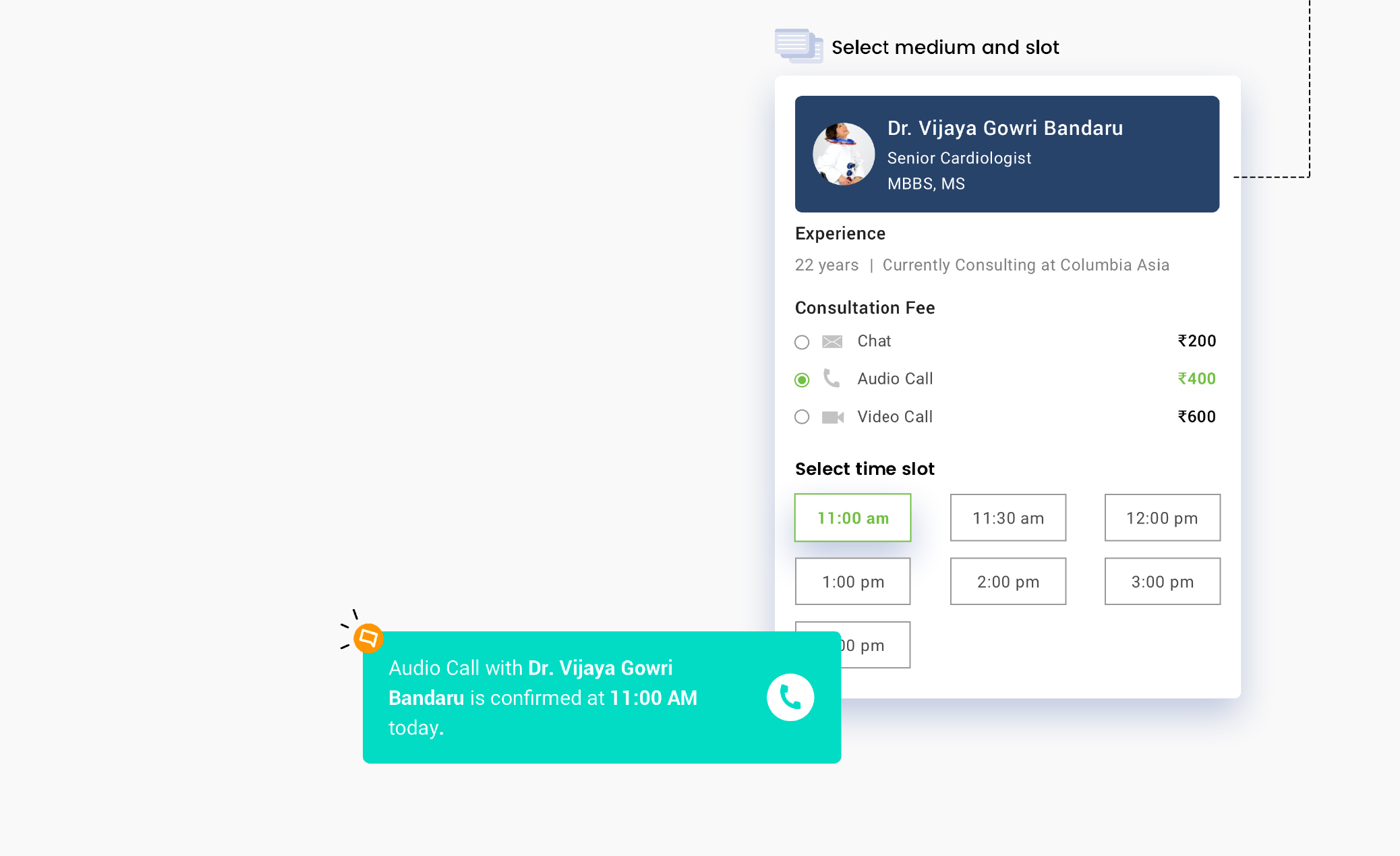
We laid out all services a customer could avail like booking appointments, availing telehealth services, viewing the details of insurance policies, booking health and diagnostic tests, and more on the dashboard itself for efficiency.
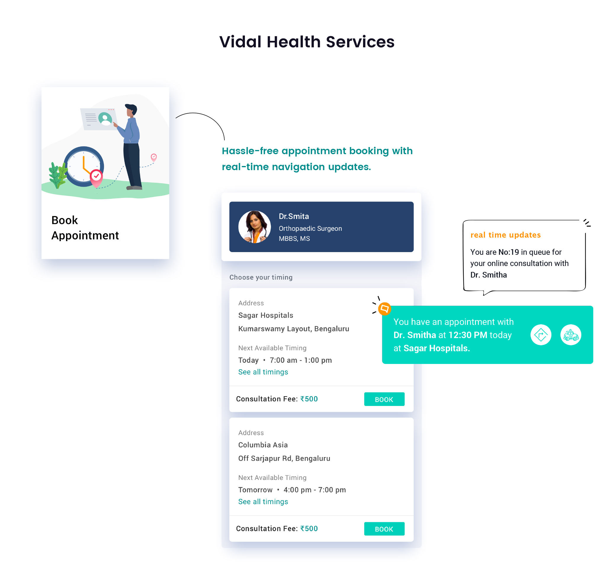
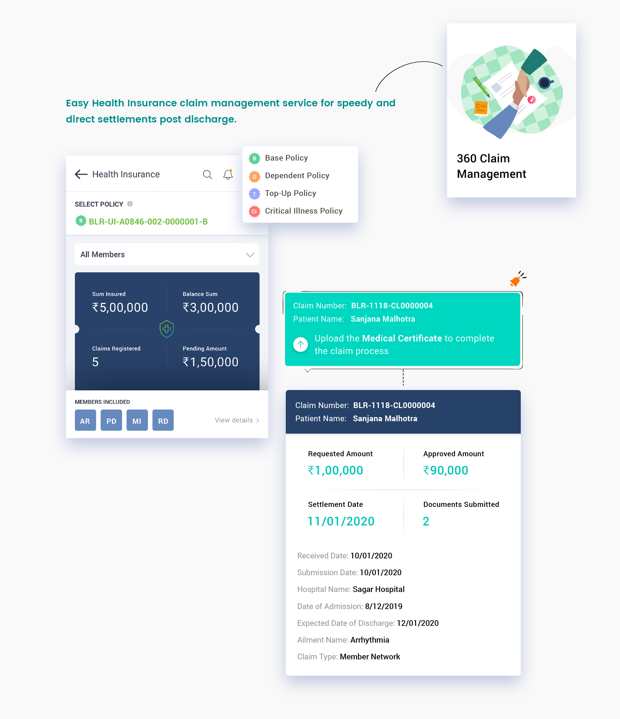
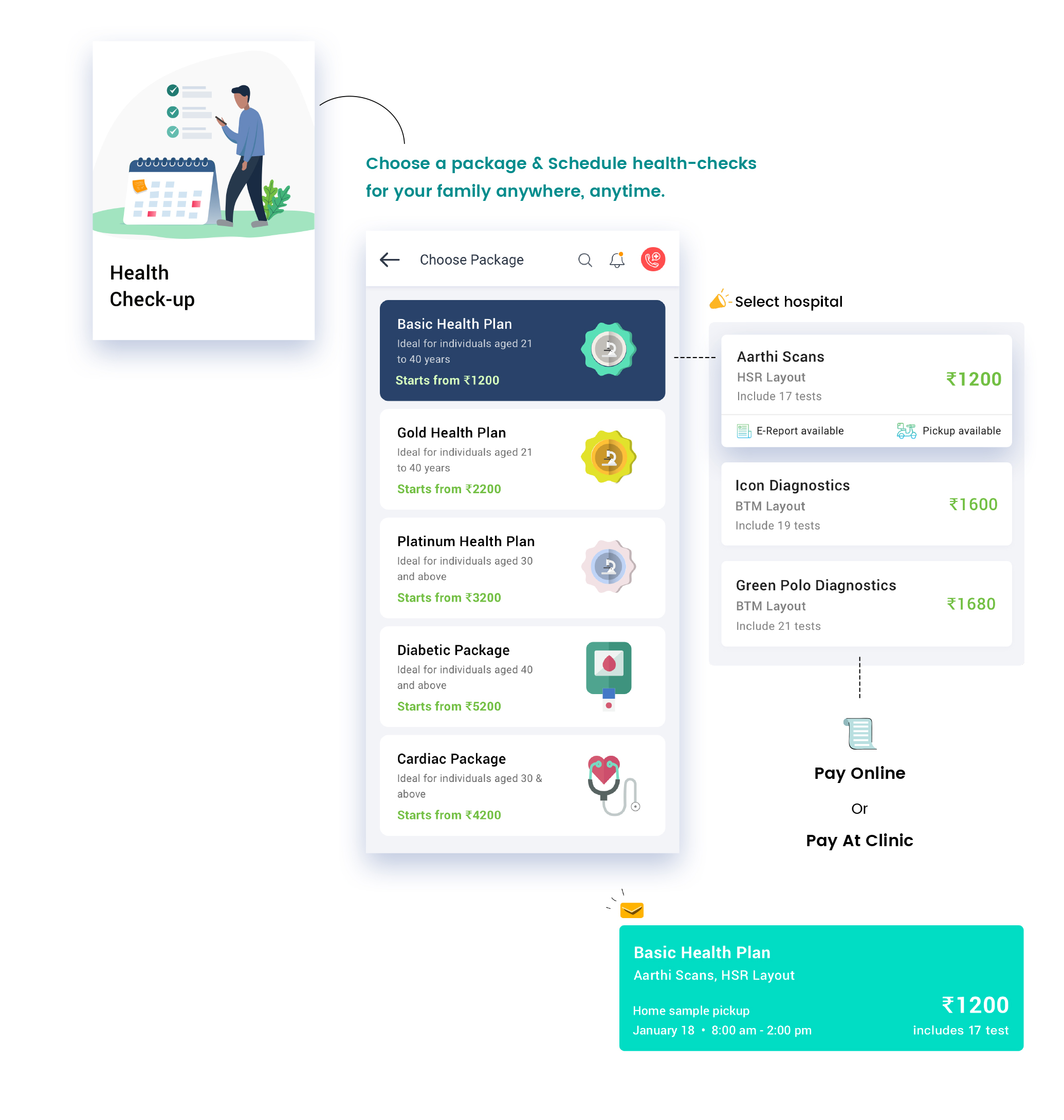
We used blue and green as the main colors in harmony with the logo. Blue is a staple color in the medical field as it symbolizes calmness and trust. Green on the other hand is synonymous with nature, health, and renewal.
the result
Our end goal was to make the health app as easy and intuitive as possible to increase user retention and leave the customers with a sense of trust after using the application.
Getting results & delivering on the promise is what we do best
“We were looking for a detail-oriented UI/UX agency who could understand the nuances of Healthcare & Insurance, that is when we connected with Yellowchalk. They brought together exceptional user research, interaction, and visual design to the entire project. Their user obsessive attitude and detail-oriented approach to design problems were absolutely refreshing. We largely benefitted from their ideas, customer-centric designs & their approach to solve customer issues at a design/flow level. I must admit that Yellowchalk is one of the best UI UX agencies I have had the privilege of working with.”
Dr. Ieshan Bali
Product Owner, Vidal Health


